
多くの人にとって馴染みがあるのは、時系列データ系の数理モデル(アルゴリズム)よりも、テーブルデータ系の数理モデル(アルゴリズム)の方です。
例えば、以下の数理モデル(アルゴリズム)はテーブルデータ系のものです。
- 線形回帰モデル(単回帰、重回帰、など)
- 正則化回帰モデル(Ridge回帰、Lasso回帰、など)
- 一般化線形モデル(GLMM)
- 一般化加法モデル(GAM)
- 階層線形モデル、マルチレベルモデル、一般化混合モデル
- 決定木(ディシジョンツリー)
- ランダムフォレスト
- ブースティングモデル(AdaBoost、XGBoost、LightGBMなど)
- ニューラルネットワークモデル
……などなど。
前回、テーブルデータ系の数理モデル(アルゴリズム)を使い、時系列予測モデルを作る準備をしました。具体的には、時系列特徴量を持ったデータセットを作りました。
今回は、前回準備した時系列特徴量付きデータセットを使い、テーブルデータ系の数理モデル(アルゴリズム)の中で最も一般的な線形回帰モデルで、時系列予測モデルを構築します。
必要なライブラリーの読み込み
先ず、必要なライブラリーなどを読み込みます。
以下、コードです。
import numpy as np
import pandas as pd

from sklearn.linear_model import LinearRegression
from sklearn.metrics import mean_absolute_error
from sklearn.metrics import mean_squared_error
from sklearn.metrics import mean_absolute_percentage_error

import matplotlib.pyplot as plt

plt.style.use('ggplot') #グラフのスタイル
plt.rcParams['figure.figsize'] = [12, 9] # グラフサイズ設定
利用するデータ
今回利用するデータは、前回準備した時系列特徴量付きデータセットです。
以下からダウンロードできます。
dataset.csv
https://www.salesanalytics.co.jp/6ro8
このURLから直接データセットを読み込めます。
以下、コードです。
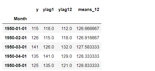
# データセットの読み込み
url='https://www.salesanalytics.co.jp/6ro8'
df=pd.read_csv(url,                         #読み込むデータのURL
               index_col='Month',           #変数「Month」をインデックスに設定
               parse_dates=True)            #インデックスを日付型に設定

df.head() #確認
以下、実行結果です。
グラフ化し確認します。
以下、コードです。
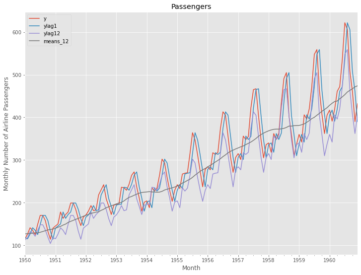
# プロット
df.plot()

plt.title('Passengers')                            #グラフタイトル
plt.ylabel('Monthly Number of Airline Passengers') #タテ軸のラベル
plt.xlabel('Month')                                #ヨコ軸のラベル
plt.show()
以下、実行結果です。
次に、読み込んだデータセットを、学習データとテストデータに分割します。
以下、コードです。
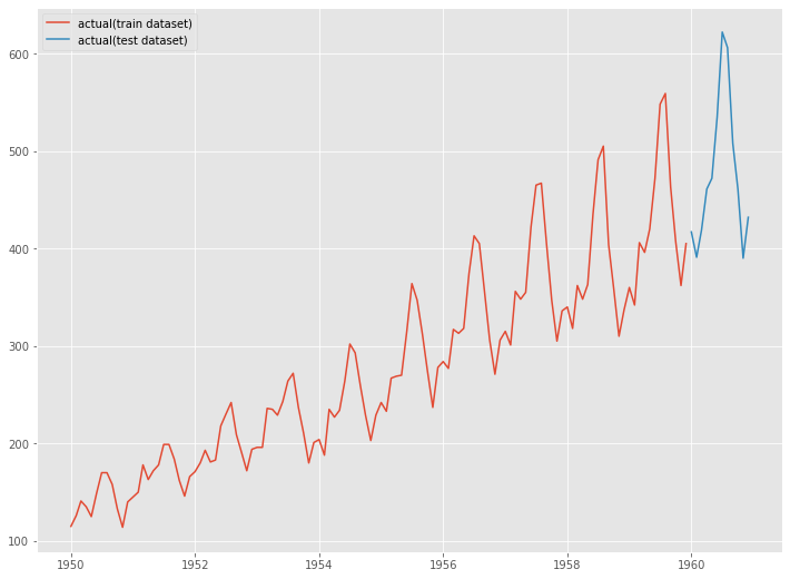
# 学習データ
train = df.iloc[:-12]

y_train = train['y']              #目的変数y
X_train = train.drop('y', axis=1) #説明変数X

# テストデータ
test = df.iloc[-12:]  #テストデータ

y_test = test['y']              #目的変数y
X_test = test.drop('y', axis=1) #説明変数X
グラフ化します。
以下、コードです。
# グラフ化
fig, ax = plt.subplots()

ax.plot(y_train.index, y_train.values, label="actual(train dataset)")
ax.plot(y_test.index, y_test.values, label="actual(test dataset)")

plt.legend()
以下、実行結果です。
学習データで線形回帰モデルを構築し、構築したモデルをテストデータで精度検証します。
予測精度の評価指標
今回の予測精度の評価指標は、RMSE(二乗平均平方根誤差、Root Mean Squared Error)とMAE(平均絶対誤差、Mean Absolute Error)、MAPE(平均絶対パーセント誤差、Mean absolute percentage error)を使います。
以下の記号を使い精度指標の説明をします。
■ 二乗平均平方根誤差(RMSE、Root Mean Squared Error)
■ 平均絶対誤差(MAE、Mean Absolute Error)
■ 平均絶対パーセント誤差(MAPE、Mean absolute percentage error)
線形回帰モデル
学習データを使って、線形回帰モデルを学習します。
以下、コードです。
regressor = LinearRegression()
regressor.fit(X_train, y_train)
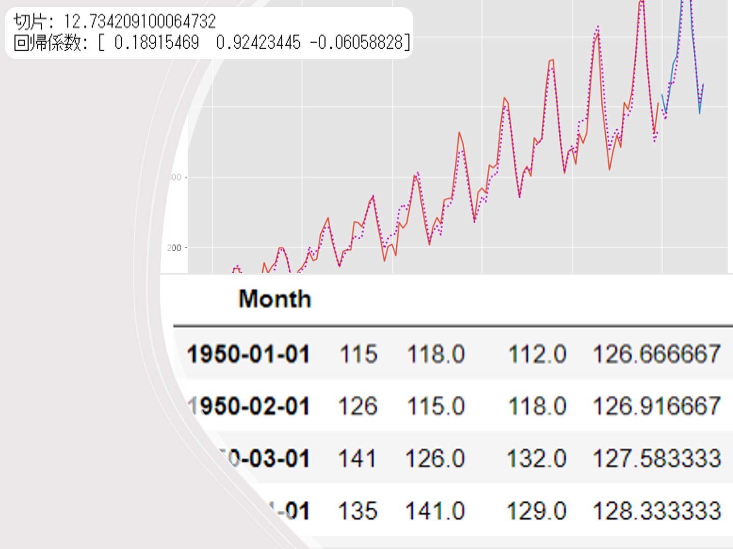
学習結果である切片と回帰係数を出力します。
以下、コードです。
# 切片と回帰係数
print('切片:',regressor.intercept_)
print('回帰係数:',regressor.coef_)
以下、実行結果です。

テストデータで精度検証します。
以下、コードです。
# 予測
train_pred = regressor.predict(X_train)
test_pred = regressor.predict(X_test)
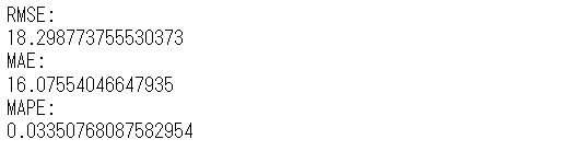
# 精度指標(テストデータ)
print('RMSE:')
print(np.sqrt(mean_squared_error(y_test, test_pred)))
print('MAE:')
print(mean_absolute_error(y_test, test_pred))
print('MAPE:')
print(mean_absolute_percentage_error(y_test, test_pred))
以下、実行結果です。
グラフ化します。
以下、コードです。
# グラフ化
fig, ax = plt.subplots()

ax.plot(y_train.index, y_train.values, label="actual(train dataset)")
ax.plot(y_test.index, y_test.values, label="actual(test dataset)")
ax.plot(y_train.index, train_pred, linestyle="dotted", lw=2,color="m")
ax.plot(y_test.index, test_pred, label="CART", linestyle="dotted", lw=2, color="m")

plt.legend()
以下、実行結果です。
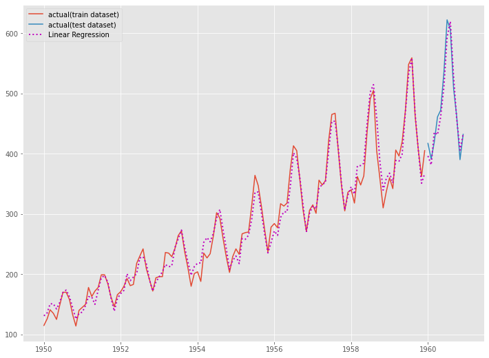
最もシンプルな線形回帰モデルであっても、時系列特徴量でモデル化することで、そこそこの精度の時系列予測モデルを構築できることが分かります。
時系列特徴量の作り方によっては、大量に時系列特徴量作ることがあります。その中では、時系列特徴量同士の相関が非常に高くなることがあります。
そういう意味でも、正則化項付き線形回帰モデル(Ridge回帰、Lasso回帰、Elastic net回帰など)で対応した方がいいかもしれません。
次回
今回は、前回準備した時系列特徴量付きデータセットを使い、テーブルデータ系の数理モデル(アルゴリズム)の中で最も一般的な線形回帰モデルで、時系列予測モデルを構築しました。
次回は、今回と同じ時系列特徴量付きデータセットを使い、正則化項付き線形回帰モデル(Ridge回帰、Lasso回帰、Elastic net回帰など)で時系列予測モデルを構築します。