
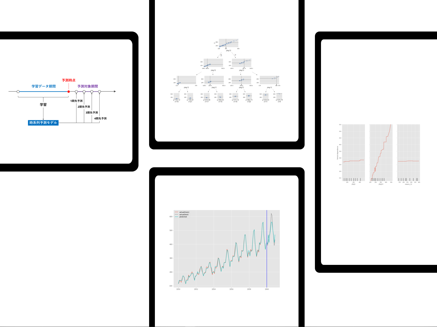
時系列予測モデルの基本は1期先予測です。例えば、時系列データが日単位である場合、1期先予測とは、学習データ期間の次の日を予測することです。
実務上は、1期先だけではなく、もっと先を予測することが多いです。例えば、2期先予測(翌々日)、3期先予測(翌翌々日)、…などです。複数先予測(Multi-Step ahead prediction)です。
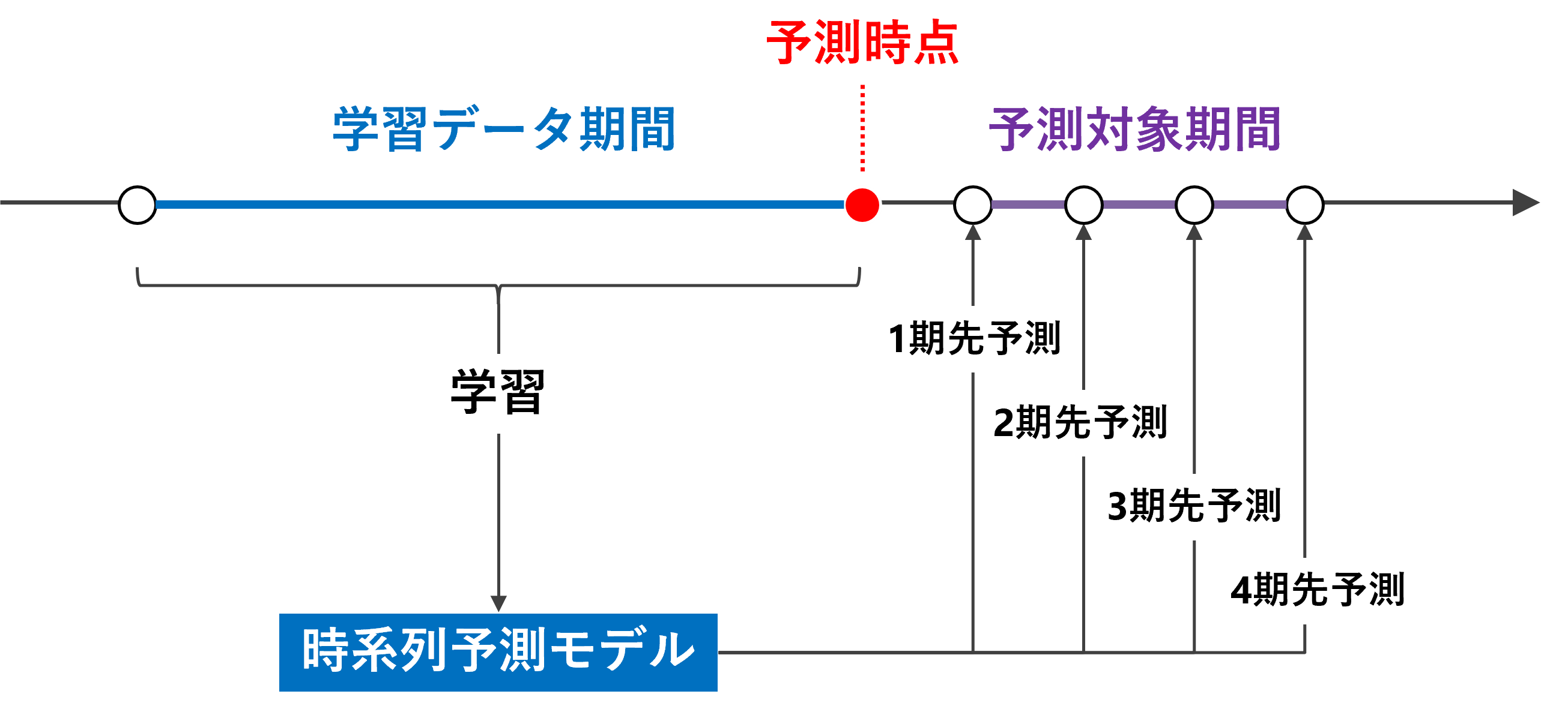
複数先予測(Multi-Step ahead prediction)を実現する方法の1つとして、「1期先予測モデルを1つ作り再帰的に利用する方法」があります。
これは、1期先予測モデルを使いまわして、複数先予測を実現しようという考え方です。
例えば、過去90日間のデータを使う予測モデルの場合、利用するデータ期間をスライドさせながら……
- 1期先予測:1期先予測対象日前の過去90日間のデータを使う
- 2期先予測:1期先予測対象日前の過去89日間のデータ+前日の予測値のデータを使う
- 3期先予測:1期先予測対象日前の過去88日間のデータ+前日と前々日の予測値のデータを使う
……といった感じで、予測データを使いながら予測を実施します。
予測モデルが1つで済むというのが利点です。ただ、2期先予測、3期先予測、……をするとき、その前までの予測値を過去の観測データの代わりに予測データを利用するという気持ち悪さは生まれます。
前回は、「テーブルデータ系モデルで複数先予測(正則化項付き線形回帰)」というお話しをしました。
今回は、前回と同じ時系列特徴量付きデータセットを使い、ディシジョンツリー(決定木)で時系列予測モデルを構築し複数先予測(Multi-Step ahead prediction)を実施します。
必要なライブラリーの読み込み
先ず、必要なライブラリーなどを読み込みます。
以下、コードです。
import numpy as np
import pandas as pd
import datetime

from sklearn.tree import DecisionTreeRegressor
from sklearn.inspection import PartialDependenceDisplay

from sklearn.metrics import mean_absolute_error
from sklearn.metrics import mean_squared_error
from sklearn.metrics import mean_absolute_percentage_error

from dtreeviz.trees import dtreeviz

import matplotlib.pyplot as plt
plt.style.use('ggplot') #グラフのスタイル
plt.rcParams['figure.figsize'] = [12, 9] # グラフサイズ設定
利用するデータ
今回利用するデータは、前回準備した時系列特徴量付きデータセットです。
以下からダウンロードできます。
dataset.csv
https://www.salesanalytics.co.jp/6ro8
このURLから直接データセットを読み込めます。
以下、コードです。
url='https://www.salesanalytics.co.jp/6ro8'
df=pd.read_csv(url, #読み込むデータのURL
index_col='Month', #変数「Month」をインデックスに設定
parse_dates=True) #インデックスを日付型に設定
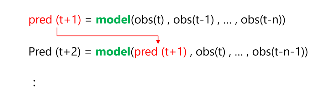
df.head() #確認
以下、実行結果です。
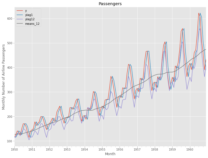
グラフ化し確認します。
以下、コードです。
# プロット
df.plot()
plt.title('Passengers')                            #グラフタイトル
plt.ylabel('Monthly Number of Airline Passengers') #タテ軸のラベル
plt.xlabel('Month')                                #ヨコ軸のラベル
plt.show()
以下、実行結果です。
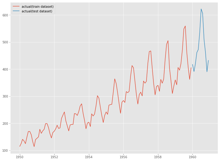
次に、読み込んだデータセットを、学習データとテストデータに分割します。
以下、コードです。
# 学習データ
train = df.iloc[:-12]
y_train = train['y']              #目的変数y
X_train = train.drop('y', axis=1) #説明変数X

# テストデータ
test = df.iloc[-12:]  #テストデータ
y_test = test['y']              #目的変数y
X_test = test.drop('y', axis=1) #説明変数X
グラフ化します。
以下、コードです。
# グラフ化
fig, ax = plt.subplots()
ax.plot(y_train.index, y_train.values, label="actual(train dataset)")
ax.plot(y_test.index, y_test.values, label="actual(test dataset)")
plt.legend()
以下、実行結果です。
学習データでディシジョンツリー(決定木)を構築し、構築したモデルをテストデータで精度検証します。
予測精度の評価指標
今回の予測精度の評価指標は、RMSE(二乗平均平方根誤差、Root Mean Squared Error)とMAE(平均絶対誤差、Mean Absolute Error)、MAPE(平均絶対パーセント誤差、Mean absolute percentage error)を使います。
以下の記号を使い精度指標の説明をします。
■ 二乗平均平方根誤差(RMSE、Root Mean Squared Error)
■ 平均絶対誤差(MAE、Mean Absolute Error)
■ 平均絶対パーセント誤差(MAPE、Mean absolute percentage error)
学習データで学習
学習データを使って、ディシジョンツリー(決定木)を学習します。
以下、コードです。
regressor = DecisionTreeRegressor(max_depth=5, random_state=123)
regressor.fit(X_train, y_train)
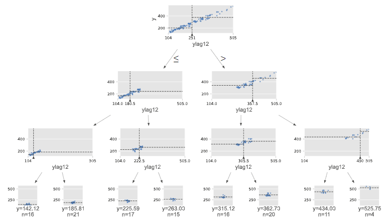
ディシジョンツリー(決定木)を図示化します。
以下、コードです。
# 決定木の図示化
from dtreeviz.trees import dtreeviz

viz = dtreeviz(regressor,
               X_train,
               y_train,
               target_name='y',
               feature_names=X_train.columns
              )

viz
以下、実行結果です。
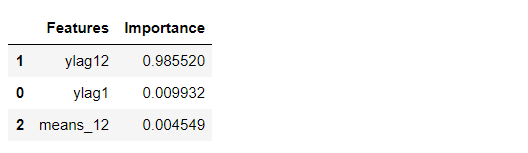
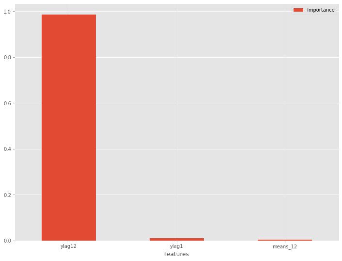
特徴量重要度(Feature Importances)を見てみます。
以下、コードです。
# 特徴量重要度(Feature Importances)
df_importance = pd.DataFrame(zip(X_train.columns, regressor.feature_importances_),
                             columns=["Features","Importance"])

df_importance = df_importance.sort_values("Importance",
                                          ascending=False)

df_importance #確認
以下、実行結果です。
特徴量重要度をグラフ化します。
以下、コードです。
# グラフ化
df_importance.plot.bar(x='Features',y='Importance', rot=0)
以下、実行結果です。
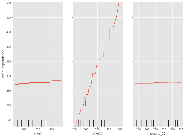
部分従属プロット(Partial Dependence Plot)を見てみます。
以下、コードです。
# 部分従属プロット(Partial Dependence Plot)
PartialDependenceDisplay.from_estimator(regressor, X_train, [0,1,2])
以下、実行結果です。
予測の実施
学習期間
学習データ期間の目的変数yの値を予測します。学習データ期間の説明変数Xのデータは既知なので、学習し求めた予測モデルをそのまま利用します。
以下、コードです。
train_pred = regressor.predict(X_train)
テストデータ期間
テストデータ期間の目的変数yの値を予測します。テストデータ期間の説明変数Xのデータは未知のものが混在しているので、工夫が必要です。
要は、「1期先予測モデルを1つ作り再帰的に利用する方法」で「複数先予測」(Multi-Step ahead prediction)を実施していきます。
以下、コードです。
# 学習データのコピー
y_train_new = y_train.copy()

# 説明変数Xを更新しながら予測を実施
for i in range(len(y_test)):

    #当期の予測の実施
    X_value =  X_test.iloc[i:(i+1),:]
    y_value_pred = regressor.predict(X_value)
    y_value_pred = pd.Series(y_value_pred,index=[X_value.index[0]])
    y_train_new = pd.concat([y_train_new,y_value_pred])

    #次期の説明変数Xの計算
    lag1_new = y_train_new[-1] #ylag1
    lag12_new = y_train_new[-12] #ylag12
    means_12_new = y_train_new[-12:].mean() #means_12

    #次期の説明変数Xの更新
    X_test.iloc[(i+1):(i+2),0] = lag1_new
    X_test.iloc[(i+1):(i+2),1] = lag12_new
    X_test.iloc[(i+1):(i+2),2] = means_12_new

# 予測値の代入
test_pred = y_train_new[-12:]
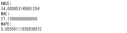
予測モデルのテスト(テストデータ利用)
テストデータで精度検証します。
以下、コードです。
print('RMSE:')
print(np.sqrt(mean_squared_error(y_test, test_pred)))
print('MAE:')
print(mean_absolute_error(y_test, test_pred))
print('MAPE:')
print(mean_absolute_percentage_error(y_test, test_pred))
以下、実行結果です。
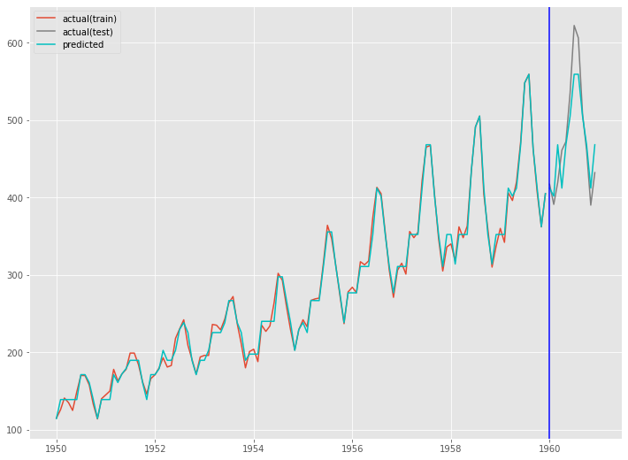
グラフ化します。
以下、コードです。
fig, ax = plt.subplots()

ax.plot(train.index, y_train, label='actual(train)')
ax.plot(test.index, y_test, label='actual(test)', color='gray')
ax.plot(train.index, train_pred, color='c')
ax.plot(test.index, test_pred, label="predicted", color="c")
ax.axvline(datetime.datetime(1960,1,1),color='blue')
ax.legend()

plt.show()
以下、実行結果です。
まとめ
今回は、前回と同じ時系列特徴量付きデータセットを使い、ディシジョンツリー(決定木)で時系列予測モデルを構築し複数先予測(Multi-Step ahead prediction)を実施しました。
そこで利用した方法は「1期先予測モデルを1つ作り再帰的に利用する方法」というものでした。
次回は、今回と同じ時系列特徴量付きデータセットを使い、ランダムフォレストで時系列予測モデルを構築します。